
The hero section is the first thing visitors see when they land on your website. It’s a powerful tool for making a strong first impression, setting the tone for your brand, and guiding users towards your desired actions. An impactful hero section can capture attention, convey your message, and encourage engagement – all within the first few seconds of a user’s visit. In this blog post, we’ll explore the essential elements of a successful hero section and provide tips on how to create one that truly resonates with your audience.
Understand the Purpose of Your Hero Section
Before diving into design and content, it’s crucial to understand the primary purpose of your hero section. Typically, hero sections aim to achieve one or more of the following:
Communicate the Core Message: Your hero section should immediately convey what your website is about. Whether it’s a product, service, or mission, the message should be clear and concise.
Establish Brand Identity: The hero section is an opportunity to showcase your brand’s personality and values. Through design elements like colours, typography, and imagery, you can make a strong brand statement.
Drive Action: Often, the hero section includes a call-to-action (CTA) that encourages users to take the next step, whether that’s signing up for a newsletter, exploring a product, or contacting your team.
Understanding these goals will guide your design decisions and help you create a hero section that effectively supports your website’s objectives.
Craft a Compelling Headline
The headline is the most prominent text in your hero section, so it needs to be both impactful and informative. Here are some tips for crafting a compelling headline:
Keep it Short and Sweet: Your headline should be concise, ideally no more than a few words. It should convey the essence of your offering without overwhelming the reader.
Use Powerful Language: Strong, action-oriented language can make your headline more engaging. Verbs like “discover,” “transform,” or “experience” can create a sense of urgency or excitement.
Be Clear and Specific: Avoid vague statements. Your headline should clearly communicate what the user can expect from your site. For example, instead of “Innovative Solutions,” try “Cutting-Edge Tech Solutions for Growing Businesses.”
Remember, the headline is often the first text users read, so it needs to make an immediate impact.
Incorporate High-Quality Imagery
Imagery plays a crucial role in creating an impactful hero section. The right image can evoke emotion, reinforce your message, and draw users into your content. Here’s how to choose and use images effectively:
Choose Relevant Images: The image you select should be closely related to your brand and message. For example, a tech company might use images of sleek devices, while a travel website could feature stunning landscapes.
Use High-Resolution Photos: Low-quality images can make your website look unprofessional. Always use high-resolution images that look crisp and clear on all devices.
Consider Background Images or Videos: A full-width background image or a looping video can add depth and visual interest to your hero section. However, ensure that the background doesn’t distract from the headline or CTA.
When done right, imagery can be a powerful tool to enhance the overall impact of your hero section.
Optimise Your Call-to-Action (CTA)
The CTA is a critical element of your hero section, as it directs users to take the next step. A well-designed CTA can significantly boost conversions. Here are some tips for optimising your CTA:
Make It Stand Out: Your CTA button should be prominently placed and easy to spot. Use contrasting colours to ensure it stands out against the background.
Use Actionable Text: The text on your CTA should be action-oriented, clearly stating what the user will do next. For example, instead of a generic “Submit,” try “Get Your Free Quote” or “Start Your Free Trial”.
Test Placement and Design: The placement of your CTA can affect its effectiveness. Experiment with different positions (e.g., centred, aligned to the left or right) to see what works best. Also, consider the size and shape of the button – larger buttons often perform better.
A strong CTA can guide users toward the desired action, making it a vital component of your hero section.
Ensure Responsive Design
With the increasing use of mobile devices, it’s essential that your hero section is fully responsive. A hero section that looks great on desktop but is difficult to navigate on mobile can drive users away. Here’s how to ensure your design is responsive:
Test Across Devices: Make sure your hero section is easy to read and interact with on all screen sizes, from desktops to smartphones.
Adjust Image Sizes: Use responsive images that scale correctly on different devices. You might also consider using different images for mobile and desktop versions to ensure the best user experience.
Simplify for Mobile: On smaller screens, simplify your hero section by reducing text size, using shorter headlines, and possibly omitting non-essential elements.
Responsive design is no longer optional; it’s a necessity for ensuring that all users have a positive experience on your site.
Leverage Typography
Typography can greatly influence the effectiveness of your hero section. The fonts you choose, as well as their size, weight, and colour, can impact readability and the overall aesthetic. Here’s how to use typography effectively:
Choose Readable Fonts: Opt for clean, legible fonts that are easy to read at a glance. Avoid overly decorative fonts that may be difficult to decipher.
Create a Visual Hierarchy: Use different font sizes and weights to create a hierarchy of information. The headline should be the most prominent, followed by any supporting text.
Consider Contrast: Ensure there’s enough contrast between your text and background to make the text readable. Dark text on a light background (or vice versa) usually works well.
Good typography can elevate your hero section, making it more engaging and easier to understand.
Analyse and Optimise
Finally, once your hero section is live, it’s important to continually analyse its performance and make adjustments as needed. Tools like Google Analytics can provide insights into how users are interacting with your hero section, such as click-through rates on your CTA or bounce rates. Based on this data, you can make informed decisions on how to optimise the section further.
A/B Testing: Experiment with different headlines, images, and CTA designs to see which combination performs best.
User Feedback: Collect feedback from users to understand their experience with your hero section. This can provide valuable insights into areas for improvement.
Ongoing analysis and optimisation will help ensure that your hero section remains effective over time.
Case Studies: Effective Hero Sections

1. Giffgaff‘s hero section is a masterclass in simplicity and bold design. The vibrant yellow background immediately grabs attention, while the concise headline, “No mid-contract price rises,” clearly communicates a key benefit. The accompanying SIM card graphic visually reinforces the brand’s focus. The CTA, “View SIM Deals,” is prominently placed, encouraging user engagement. This hero effectively combines strong visual contrast with a straightforward message, making it both memorable and effective.
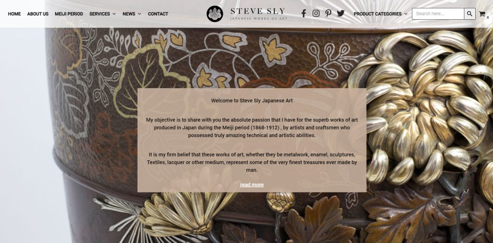
2. Steve Sly Japanese Art has a hero section that is a perfect blend of artistry and storytelling. The background image showcases impressive Japanese art, which is central to the brand’s identity. The overlay text provides a personal narrative, inviting visitors to explore the craftsmanship of the Meiji period. The use of a muted, semi-transparent text box ensures readability without detracting from the visual appeal of the artwork. This hero successfully conveys passion and expertise, drawing the user into the world of Japanese art.

3. Wick Antiques utilises a hero section that reflects its heritage and expertise in antique furniture. The hero features a striking image of an antique desk, instantly conveying the brand’s niche. The headline, coupled with a welcoming photo of the owner, creates a personal connection with visitors. The “More About Us” CTA encourages deeper exploration, enhancing user engagement. The hero balances warmth and professionalism, effectively communicating trust and authenticity.
Conclusion
The hero section is a pivotal part of your website, serving as the first point of contact between your brand and potential customers. By understanding its purpose, crafting a compelling headline, using high-quality imagery, optimising your CTA, ensuring responsive design, leveraging typography, and continuously analysing performance, you can create an impactful hero section that leaves a lasting impression. Remember, in web design, first impressions truly matter, and your hero section is your best opportunity to make a great one.