For galleries, sculpture dealers and fine art businesses, the website is not primarily a place to process transactions — it is a place to create an experience.
The photography of artworks, the atmosphere of an exhibition, the sense of what it feels like to encounter a significant piece: these are the things a fine art website needs to communicate, and they are communicated through image, not interface. Full-width, visual-first design in WordPress is the approach that has allowed some of the most prestigious art and sculpture businesses in the world to create digital experiences that match the quality of their physical spaces.
The Case for Full-Width Design
Conventional web design allocates space to a content column — typically 960px to 1200px wide — surrounded by margins and often a sidebar. This approach is practical and familiar, but it imposes significant constraints on the visual experience. Images are contained, contextualised within a framework of navigation, text and page furniture. They are never allowed to simply exist.
Full-width design removes these constraints. Images extend to the edges of the browser window regardless of screen size, creating an immersive visual experience that commands attention. For fine art and sculpture businesses, this is not merely an aesthetic preference — it is an alignment between medium and message. Art fills a room. A website that allows it to fill a screen is paying it the same respect.
WordPress Themes Built for Full-Width Experiences
The WordPress theme ecosystem has evolved significantly in response to the demand for visual-first design. Themes like Divi, Astra (with full-site editing), OceanWP and Blocksy offer full-width templates with excellent performance and design flexibility. The Kadence theme has become particularly popular in the gallery and premium retail space for its combination of visual control and technical performance. The native WordPress block editor (Gutenberg) now supports cover blocks, group blocks and full-width alignment across virtually any theme — making the full-width editorial approach accessible without premium theme purchases.
For art galleries and sculpture dealers, the choice of theme is less important than the choice to build pages manually using the block editor or a page builder like Elementor Pro. This approach gives complete control over the composition of each page — how images and text are proportioned, how sections transition, how much breathing room exists between elements. The result can look entirely custom without requiring a custom-built theme.
Performance Considerations for Image-Heavy Sites
The greatest technical challenge with full-width, image-heavy WordPress sites is performance. Serving a 2400px-wide image to a mobile user on a 390px screen is wasteful and slow. Modern WordPress setups address this through responsive image srcsets (built into WordPress core), CDN delivery (typically via Cloudflare or a host-level CDN), and lazy loading (supported natively in WordPress from version 5.5). Image optimisation plugins such as Imagify, ShortPixel or EWWW Image Optimizer handle compression automatically on upload, ensuring images are visually crisp but technically lightweight.
For galleries and fine art businesses where image quality is non-negotiable, this technical infrastructure is essential. A full-width hero image that takes four seconds to load is worse than no hero image at all — it signals to the visitor that the site is not properly cared for, an impression that immediately undermines the brand’s credibility.
Navigation Architecture for Gallery-Style Sites
Full-width visual sites require particular care with navigation architecture. The classic approach — a persistent top navigation bar — can interrupt the immersive quality of a full-screen image layout. Many gallery WordPress sites address this with transparent or minimal headers that overlay the hero image without obscuring it, collapsing to a sticky bar as the user scrolls. Hamburger menus that open into a full-screen overlay are another approach that preserves the visual-first experience while providing full access to site structure.
The key principle is that navigation should serve discovery without dominating experience. In a physical gallery, wayfinding signage exists but it does not compete with the art. The same principle applies online.
Case Study: Bowman Sculpture
Bowman Sculpture is a premier London gallery specialising in fine art sculptures from the 19th century to the present day, with a collection that spans European Romantic masters, Impressionist works, and modern contemporary sculptures. Located in theUK, the gallery is one of the most respected dealers of its kind.
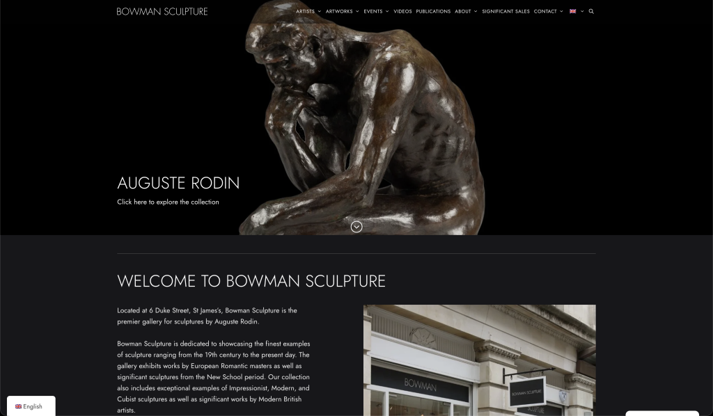
The website is a textbook demonstration of full-width, visual-first WordPress design applied to a fine art context. Hero imagery — in this case, dramatic photography of significant sculptural pieces — occupies the full viewport on entry, creating an immediate sense of gravitas and quality. The navigation is discreet and functional, positioned not to compete with the photography but to serve the visitor once they are ready to explore.
As the visitor scrolls, the site maintains its editorial quality: sections are well-proportioned, typography is consistent and refined, and the photography throughout is of a standard that honours the work it depicts. The gallery’s breadth — from significant historical pieces to contemporary sculptures — is communicated through the site’s structure without feeling like a catalogue dump.
For a gallery of this standing, a website that falls short in its design would do genuine reputational damage. Bowman Sculpture’s site is not merely adequate — it is an extension of the gallery’s identity, and it does full justice to the quality of work housed at 6 Duke Street.
Building Your Own Visual-First WordPress Site
For designers and developers looking to apply these principles to their own projects, the most important lessons from the fine art space are: commit fully to the visual-first philosophy (do not hedge by adding sidebars, widgets or promotional banners that compete with imagery); invest in photography quality before you invest in design features; and treat performance as a design consideration, not an afterthought. A site that looks beautiful but loads slowly has failed as a visual-first experience, regardless of how good the design itself is.
Conclusion
Full-width, visual-first WordPress design has become the standard of excellence for galleries, sculpture dealers and fine art businesses — and the tools to execute it are more accessible than ever. Bowman Sculpture demonstrates what this approach looks like at its best: an immersive, beautiful digital presence that communicates the quality of the gallery’s collection and the seriousness of its expertise. For any creative or premium business looking to build a website that genuinely reflects the standard of its work, the full-width WordPress approach is a compelling and highly effective foundation.